2025 Posit Plotnine and Great Tables Contest Submission
edited 2025-11-10
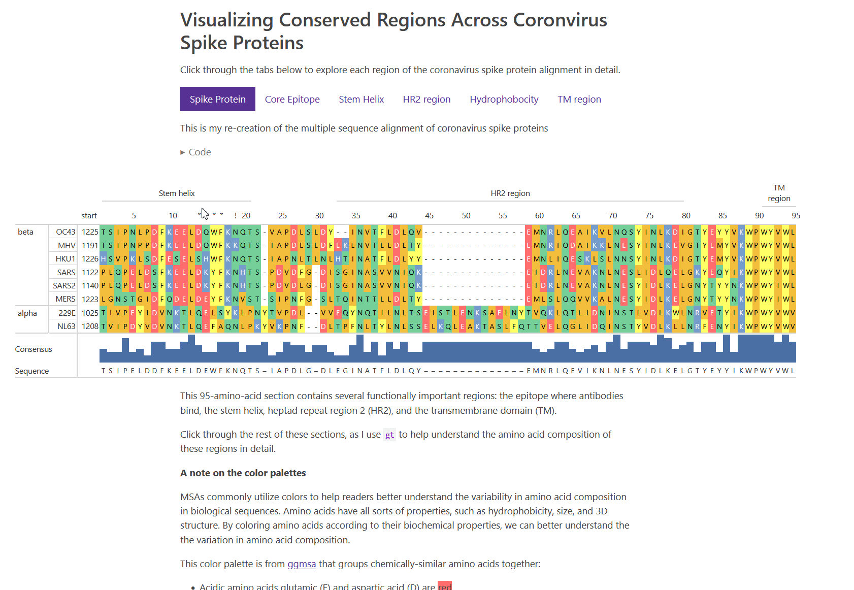
Hooray! I won a prize. “The Best gt Table” was awarded to my visualization of coronavirus spike proteins.
This table submission is remarkable for its audacity: multiple sequence alignment has its own established tooling, yet here’s someone doing it with gt and it actually works! It’s obvious to me that the author saw a table package not as a constraint but as a canvas for domain-specific visualization. Maybe the future of bioinformatics might involve more Quarto documents with/ tables and fewer standalone desktop applications?
edited 2025-12-15
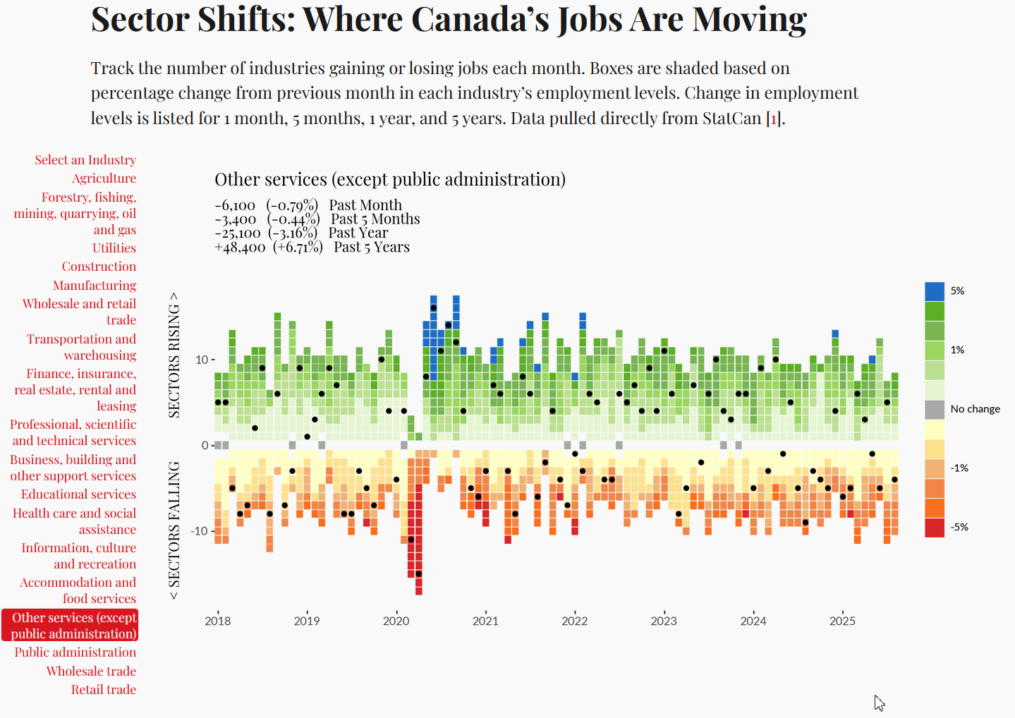
I also won the Grand Prize for the 2025 Plotnine contest.
We are happy to announce Victor’s Canada Labour Statistics visualisation as the winner of the 2025 Plotnine plotting contest.
The backdrop of this visualisation is an aggregate of all the categories of industries. It encodes three dimensions. While the Grammar of Graphics makes it easy to encode dimensions into visual elements, i.e., aesthetic mapping, this visual shines because of what it has chosen to represent, and how it represents it: time along the horizontal, ranking of the percentage change in employment numbers on the vertical, and the percentage change itself as a colour.
Yet there is more information in the backdrop than the explicit dimensions; for each year, the vertical range of the tiles encodes the performance of the job market across all industries. At first, it is hidden, then it is obvious. This is a range plot! The entire job market moves down between 2020 and 2023 and then moves up in 2024. The deliberate choice of the colours at lower and higher ends of the colour scale attracts the eye to the changes that need scrutiny. For an ordinal variable, why would a blue follow a sequence of greens in the colour scale? Well, to catch your attention. An enallage is a figure of speech where wrong grammar is used deliberately for an emphatic stylistic effect; Victor’s choice achieves a similar effect.
Well, we was gifted
On August 21 2025, Posit announced the 2025 Table and Plotnine contests. I was always impressed with the resulting submissions from previous years, so this year I decided to participate.
Initially, I decided that the plotnine contest sounded like a great opportunity to see how to use the python port of ggplot2. I had no experience with plotnine, but lots with ggplot2.
However, after finishing my submission for plotnine, I turned my attention to the table contest. I wasn’t certain if I had the time to make another high quality submission. But I felt that I had a great idea that I haven’t seen done before. So I reconsidered and decided to make a smaller single post entry for the table contest.
Exploring Canada Job Market Data with plotnine
For the 2025 plotnine contest, I wanted to explore official Canadian labour statistics using Plotnine.
Using quarto, I created a website, which hosts the final submitted visualization, and a tutorial on how I developed the visualization.
The visualization uses the plotnine, which is a visualization library from python, heavily inspired by the grammar of graphics. I used polars to crunch the data.
Coronavirus Spike Proteins with r-gt
For the 2025 Posit Table contest I wanted to explore how MSAs can be effectively visualized using the r package gt. This has been something I have wanted to do for a long time, and felt like this would be great way to share some of the exploration with the community.